Trying to name the best displays in pixel art is a difficult task—after all, the majority of games had pixel art for graphics up until 3D became a possibility. Along with that, there are several indie and app games that have amazing pixel graphics, but go overlooked due to poor advertising or accessibility. For that reason, I made a few loose guidelines to this list: I would pick the games regardless of graphical prowess, and instead focus on the detail of the art within the given constrictions of the platform and the overall visual appeal.
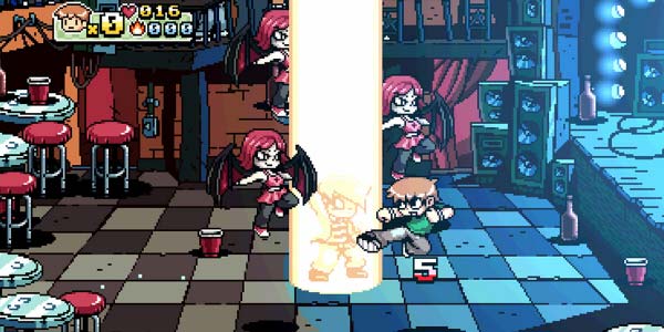
5) Scott Pilgrim
The Scott Pilgrim game imitates plenty of other games—with an over world map similar to some Mario games and a clear Street Fighter influence for their sprite designs and gameplay. However, the art is still incredibly playful, with thick lines making the characters pop from the background and detailed sceneries that were neither distracting nor plain. It’s clear that each character design and their attack animations were the product of a careful pixel artist, and combined with the retro fonts and symbols, the art style makes this game stand out.
4) FEZ
FEZ is a beautiful game that has very meticulously detailed levels despite the simplicity of FEZ’s style. Although it probably uses a tile system, the each setting is so carefully put together that it seems hand-crafted. The game switches color schemes throughout the game, from a bright and colorful regular style, to a desaturated style when it rains, to just black and green with dithering to show light whenever Gomez wanders through the sewers. The game has plenty of 3D elements—the cubes you collect and all of the environments exist in three dimensions, afterall—but the seamless integration of pixel art with the 3D world is a major factor in getting the game to appear as a 2D platformer.
3) Legend of Zelda: Link to the Past
A Link to the Past has aged pretty well, and has some of the best graphics for its time and system. Despite having smaller tiles and sprites, they fit in enough detail to make it clear what each object is (actual bushes instead of random dots that were supposed to be grass) and what it is made of (brick walls instead of a simple outline for the walls). The colors also pop and the shading, where it appears, looks fantastic and doesn’t clash with the rest of the scenery. The overhead vied of the Zelda games influenced many after it, and this game didn’t fail to improve upon it—rain looks amazing, and the transition from scene to scene is also good compared to other older games.
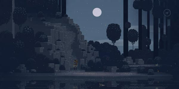
2) Sword & Sworcery
Sword & Sworcery might appear to be a simple game with minimal graphics, but those pixels hold a surprising amount of detail if you think about it. Each scene is crafted pixel by pixel and the animals and creatures are all cleverly detailed. Instead of trying to fit as much as possible into each pixel, the game uses an abstract approach—here, less is more. It only takes a single pixel to show a face or a bracelet, while in other games it would certainly take more than that—which means the sceneries and character designs are amazingly complex, for such a low resolution.
1) Street Fighter 3 – Third Strike
Street Fighter 3: Third Strike makes it here primarily because of its amazing animated sprites. Instead of focusing on appearing realistic, the game went for a more anime-styled appearance, and made their sprites larger than typical games. This allowed them to fit more detail into the game and make their animated sprites look incredibly fluid and lifelike. Along with that, different actions will cause the character to switch colors—and although these different sprites might appear for just a few seconds, they are just as intricately detailed as the normal sprites. The backgrounds of the game are also nothing to scoff at, with many of them featuring beautiful 3D panoramas.
Honorable Mentions: Pokémon, Minecraft, Super Mario Bros


i would of had some diffrent choices
Capcom indeed did some of the best pixel art, with precise pixel placements on sprite edges to create the illusion of curves and clear edge difinition.
Scott Pilgrim, with the fugly black lines, is just the opposite: a great example of weak, amateurish pixel art.
I would have something like Risk of Rain or Dungeon of the Endless
Clearly the author knows nothing about the golden age of 2D gaming. Shadow of the Beast, Unreal , Gods, Agony (all for the Amiga)… just to name a few.